Website Navigation
- The website is a tool to present exploratory data analysis results. Results are shown for all campuses combined, and for each campus separately.
- Each tab on the header of the website corresponds to a set of questions within the Basic Needs Survey. Some of these tabs have a drop-down menu (denoted by a down arrow) to further organize questions by topics.
- The top of each page contains a brief paragraph which explains a general overview of questions captured on the page.
- Within the page, questions were plotted using the most appropriate style for the questions (histogram, barplot, table, etc.). Each graph then has a brief description below it analyzing the results of the graph with the appropriate summary statistics (minimum, mean, max, proportions, etc.).
The Drop Down Menu
- The per-campus results for select question are hidden in drop down menus denoted by the campus and chart icons:
🏫 📊 Click anywhere on this text to open the drop down.
- And by clicking the text of the drop down again you can close the menu too.
- Note: emoji’s will change depending on what device you are using (windows, apple, etc.), so viewing on multiple devices may look slightly different for each.
Figure Interpretation
- Most questions fall under one of the following types of figure styles. Here are some notes on how to interpret them
Tables
| Questions | Responses |
|---|---|
| Question 1 (n = #) | Response # (%) |
| Question 2 (n = #) | Response # (%) |
| Question 3 (n = #) | Response # (%) |
Table 1.1: Table Caption
- Tables were used to group together sets of questions that typically had a Yes/No response pattern.
- The left column represents the questions along with the numbers of students who responded to the question.
- The right column represents the number of student who responded a certain way, along with the percent that responded this way (out of all the students in total that responded).
Barplots
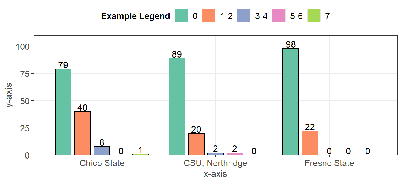
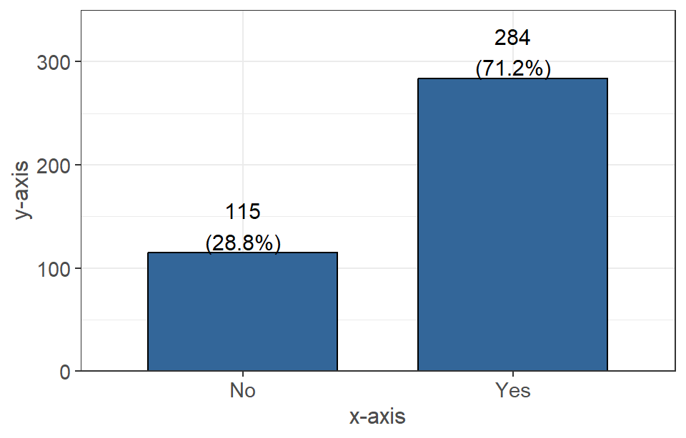 Figure 1.1: Figure Caption
- Barplots were used to graph questions which had nominal or ordinal responses (labeled data that’s separated into different groups). The x-axis is the response option, and the y-axis is the frequency in which they occured.
- The numbers above the bars represent the total respondents in the given group, as well as the percent of the data that they comprise.
Density Plots
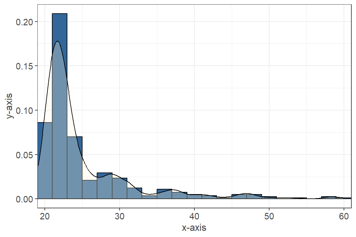 Figure 1.2: Figure Caption
- Similar to the histogram above, the density plot shows the distribution for a numeric variable of interest on the x-axis and the “density” of the data on the y-axis (this is how often the value occurs in the data).
- The smooth curve helps show the distribution of the data (as a continuous variable).
Histogram with Boxplot
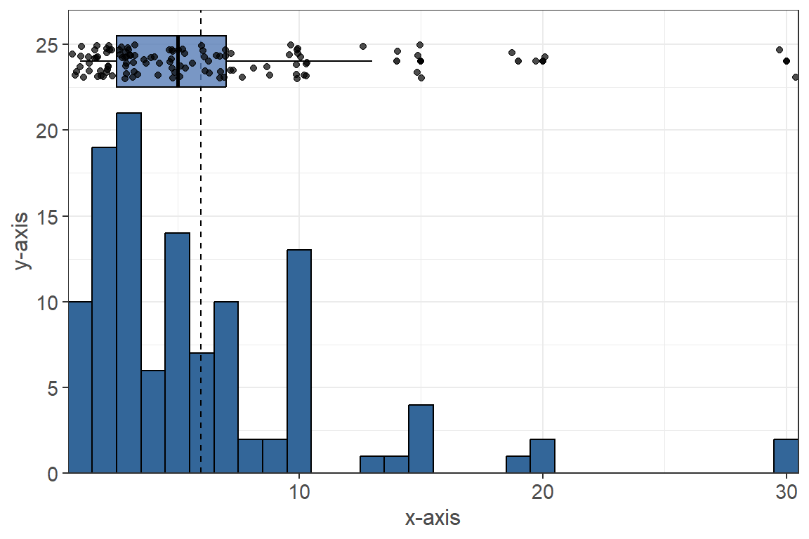 Figure 1.3: Figure Caption
- Above is a graph type used for plotting numeric questions, a histogram with a boxplot and scatter points.
- Histogram: the bottom part of the graph, these bars show the occurrence (y-axis) of our variable of interest (x-axis). The higher the bar, the more frequently the x-axis value occurs. The dotted line represents the mean value (the average across the responses).
- Boxplot: the blue box with the lines at the top, the box itself represents the middle 50% of the data (25% to 75%). The dark black line within the box represents the median value (where 50% of the data falls below).
- Scatter: these are the dots that overlay the boxplot. They are used to help show the distribution of the data along with the histogram (number of dots represents number of responses for a given value).
- Figure Caption: below each graph, a figure number and caption are placed in order to help keep track of the current page and the figure title.
Likert Plots
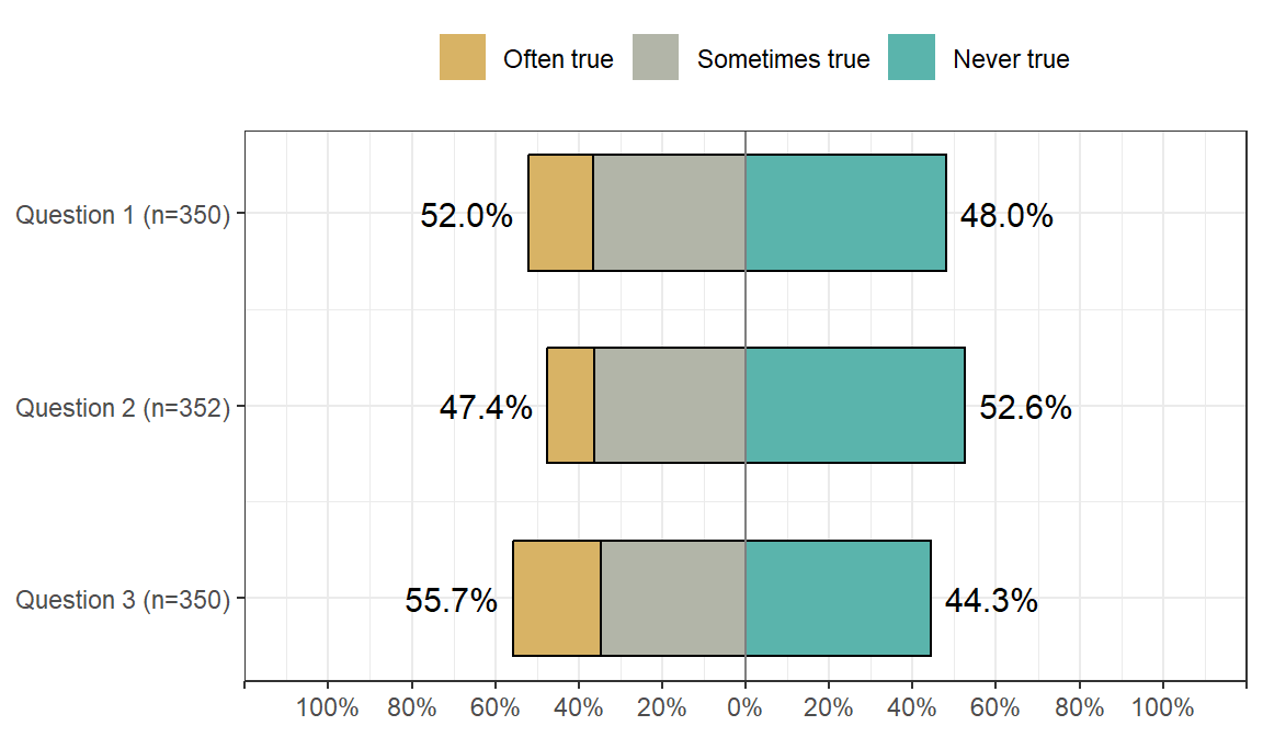
- The Likert plot is a barplot visualization for a
Likert scale, which is used to measure feelings/opinions for a specific
question.
- The center line (0%) divides the responses into two groups, such as
above where the left side of the chart represents often/sometimes true
and the right hand side represents never true.
- The percentages represent the proportion of the data for which the
“group” composes.
- The (n=#) next to the question denotes how many students responded to a specific question. The values can vary for each question within the same plot.